
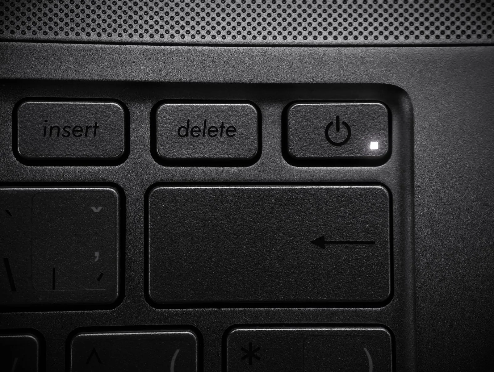
One of my clients called me on a Tuesday morning, and I could hear the stress in her voice before she even told me what happened. An employee had been cleaning up an old customer account and clicked "delete" on what looked like a duplicate order. It wasn't a duplicate. It was six months of order history for one of her biggest accounts, gone in half a second. No warning popped up. No "are you sure?" No undo button. Just gone.
This happens more often than people admit. Someone taps the wrong row, hits the wrong icon on a phone screen, or double-clicks when they meant to click once. It isn't a training problem. It's a human problem. And it's exactly the kind of mistake that good software design is supposed to catch before it becomes a crisis.
Why "Are You Sure?" Prompts Exist
A confirmation prompt is that small popup asking you to confirm before something serious happens: deleting a record, canceling an order, removing a user. It feels like a minor speed bump, but it does real work. Research from the Nielsen Norman Group, a well-known usability research firm, has found that confirmation dialogs meaningfully reduce user errors, especially before actions that cannot be undone.
The key phrase there is "cannot be undone." Confirmation prompts matter most in exactly one situation: when the next click is destructive and there's no easy way back. Deleting a customer record, voiding an invoice, removing a product from your catalog, canceling a subscription. These are the moments where a two-second pause saves hours of cleanup later.
Not every action needs this treatment. Saving a draft, changing a font, or updating a phone number doesn't deserve a warning box. If everything demands confirmation, people stop reading them and click "yes" out of habit. That's the trap, and I'll come back to it.
What an Undo Button Actually Does Behind the Scenes
A lot of business owners assume "undo" is just a clever trick, like rewinding a video. It isn't magic. It's a design decision your developer makes ahead of time, usually called a "soft delete."
Here's the plain version: when you delete something in a well-built system, the record doesn't actually disappear right away. The software just marks it as hidden and keeps it out of your normal view. It sits quietly in the background for a set period, maybe 30 days, before it's permanently removed. If someone deletes the wrong thing, restoring it takes seconds, because the data never left. Compare that to a full backup restore, which can take hours and often brings back other changes you didn't want undone.
This is why undo and soft delete matter so much for small businesses specifically. You likely don't have an IT department standing by to dig through backups at 6 p.m. on a Friday. You have whoever is in the office, trying to fix it themselves. A working undo button turns a stressful emergency into a two-click fix.
The Balance: Protection Without Annoying Everyone
Here's the tension I see most often. A business owner gets burned once, panics, and asks for confirmation popups on everything. Six months later, employees are clicking through ten warnings a day without reading a single one, because their brain has learned the popup means nothing. Security researchers call this "warning fatigue," and it defeats the entire purpose. A prompt nobody reads is worse than no prompt at all, because it creates a false sense of safety.
The fix isn't more warnings. It's smarter placement. Reserve confirmation prompts for actions that are genuinely destructive or hard to reverse: deleting records, processing refunds, removing user access, canceling recurring charges. For lower-stakes actions, skip the popup and lean on undo instead. Let people act quickly, then give them a short window to reverse course if they made a mistake. Gmail's "undo send" button is a good everyday example: it doesn't stop you from sending an email, it just gives you five seconds to catch yourself.
A Concrete Example
Back to my client. After that incident, we rebuilt her order management system with two small changes. First, deleting a customer record now requires typing the customer's name to confirm, not just clicking "yes." That extra step forces a moment of real attention. Second, anything deleted moves to a hidden "recently removed" folder for 30 days before it's gone for good. Total development time: about a day. Total cost: a fraction of what one lost customer relationship would have cost her in goodwill and re-entered data.
This connects to something I've written about before: not every safety net needs to be a full disaster recovery plan. Sometimes the fix that matters most is small, cheap, and sits right where your team clicks every day. And to be clear, this is different from the manipulative confirmation tricks I cover in dark patterns that damage customer trust — those exist to trap people into decisions they didn't want. Undo buttons and honest confirmation prompts do the opposite: they protect people from decisions they didn't mean to make.
What to Ask For When You Commission Software
If you're working with a developer on new software, or reviewing what you already have, ask three questions:
- Which actions in this system cannot be undone once they happen?
- Do those specific actions have a confirmation step, and does it clearly say what will be affected?
- When something is deleted, does it disappear instantly, or is there a recovery window?
You don't need to understand the code behind the answers. You just need someone to have thought about the questions. A good developer will already have opinions here. If they shrug and say "we'll just be careful," that's a sign to push further, because careful isn't a strategy. It's a hope.
Mistakes are going to happen. Someone on your team will eventually click the wrong thing, probably on a busy day when they're moving fast. The goal isn't to stop mistakes from happening. It's to make sure one wrong click never costs you a customer's history, a financial record, or a weekend spent rebuilding something that should have taken two clicks to restore.